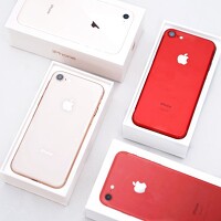
Apple's tagline for the iPhone 6S is 'the only thing that's changed is everything', highlighting that the brand knows this is a phone that looks an awful lot like last year's model.
It makes sense that Apple would try its hardest to show that, despite the handset looking identical to last year's model, there have been loads of changes under the hood that make this an attractive phone in its own right.
The chassis is stronger, the camera sharper – with a new Harry Potter-esque way of capturing your snaps – and there's even a completely new way of interacting with the screen. On paper, it's an impressive upgrade.
See the iPhone 6S in action in our video review:
But when it looks identical to the iPhone 6, people will be desperate to know if the iPhone 6S is enough of an upgrade to justify the price. While the upgrades seem great, is it worth going all the way up to the iPhone 6S, or would the 6 do?
In terms of raw price, we're in a weird situation now. Samsung and the rest of the Android crew have been slowly ratcheting up the price of their high-end phones to the point where they're actually eclipsing the iPhone 6S at launch.
However, Apple's once again been the victim of its off-kilter launch cycle, meaning it's putting its phone into a market where the Galaxy S6 is now significantly cheaper – and so the iPhone 6S has a higher price to live up to. That said, this new phone is just that: a new phone. That means some potential buyers will be enamoured with the notion of getting the latest tech on the market rather than a six-month-old handset.
In the UK, that means between £50 and £100 upfront to get the phone for £36-£38 per month (if you want a decent slug of data and minutes) with the phone starting at £539 for the 16GB model, £619 for the 64GB model and £699 for 128GB.
It's starting at $649 if you're looking to pick it up off contract in the US, with the new $32.45 monthly cost if you're thinking of getting locked into Apple's yearly upgrade plan.
In reality though, the question of who this phone is aimed at isn't that hard to answer: for most people stuck on the iPhone 5S it's clearly the upgrade they're considering, and beyond that there's the disgruntled Android owner who's tired of looking at the slicker app experience Apple offers and seeing their own handset looking sketchy in comparison.
(Of course, there are a few people that tried Windows Phones as experiments, but they'd probably be happy with just about any other phone if they're still using a Nokia Lumia 930).
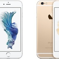
The difference between the iPhone 6 (left) and iPhone 6S (right) is nearly impossible to see
The issue Apple is trying to solve with the iPhone 6S (and the 6S Plus) is how it can convince users, especially in a market saturated with really rather brilliant smartphones, that the 'S' variant of the impressive iPhone 6 is a worthy phone to upgrade to in its own right.
When something is so visually similar, the onus is on the brand to show that the upgrades are really worth the extra cash.
Even if Apple keeps users within its own ecosystem there's every chance they'll look at the iPhone 6, which is now much cheaper – so it needs to make sure things like a stronger chassis, animated photos and a new pressable screen are worth the extra outlay when both phones will still work perfectly well in a couple of years' time.
Design
You've probably already heard, but the iPhone 6S is almost identical to last year's 6 in every way when it comes to the chassis. There are some very subtle differences, such as a slightly thicker frame and a little more heft, but it's so slight that I kept getting the two mixed up when doing side by side comparisons.
All cases fit both phones just fine too so, apart from a small S logo on the back of the phone, nobody is going to notice you've got the latest iPhone.
But there will be lots of you upgrading from the iPhone 5S, and in that case you'll need to be ready for a really big design change. The metallic chassis feels really nice in the hand, with a ceramic-like feeling on the outside (although if it's anything like the 6 then this can scuff over time if you keep it in a pocket with keys, so you'll need to think about the kind of case you'll want to keep it safe).
One of the things that Apple is touting is the fact the iPhone 6S is made of 7000 series aluminum, which is the strongest thing it's ever used in iPhone construction. The obvious connection people will make is with 'Bendgate' last year, when some users claimed their new phone had developed a slight curve in their pocket without much pressure.
The common belief was that these phones began to twist when placed in a rear pocket and sat upon. While it was proven that other metal phones actually were worse when it came to bending Apple didn't come out of the controversy well.
So it's no surprise that, while the company won't admit the real reason, the new iPhone is strong and never going to bend with such pressure. However, I feel like that we shouldn't feel happy our phones no longer bend – this seems like one of the minimum expectations I'd have of a smartphone, not a compelling reason to buy it.
The front of the phone is now covered in a new level of strength, with a glass that's far less prone to shattering when dropped on the floor – now that's something I can get behind. We've not drop tested it - we'll leave that to some other, braver reviewer - if the screen is stronger the responsiveness hasn't dropped.
In the hand, the iPhone 6S still feels like a dream. Even with the extra 14g over the iPhone it feels lightweight, easy to manipulate and really warrants the price. Samsung's new Galaxy S6 Edge invokes the same kind of feeling, and with it you don't mind spending the extra money over a more budget phone.
In terms of design, if you've seen the iPhone 6 then you've seen the 6S. The volume buttons, the power key, the silencer switch and the speaker are all in the same place as last year, with the grille at the bottom very easy to cover when you're watching videos or playing games in landscape.
If you're using the 5S, this is leagues ahead. The construction is good, the materials solid and there's no wiggle in the buttons at all. While you probably never bent your 5S, the idea that the iPhone 6S is stronger will probably please you, however unnecessary the claim is.
Apple's not done anything great with the design of the iPhone 6S, but the iPhone 6 was such a well-created phone that using the same chassis isn't going to harm its chances of success.
However, combined with the higher price and the continued presence of last year's model, I wish we were at least seeing some retooling of the phone to make it seem more attractive.
Screen
The screen on the iPhone 6S seems to be identical to last year's: we're talking a 4.7-inch affair with 750p resolution, which keeps it firmly in the 'Retina' range that the firm debuted all the way back with the iPhone 4.
It's hard to rate the display, as while it fails on resolution (quite spectacularly actually - phones a seventh the cost of the iPhone 6S offer 1080p screens, Samsung's cheaper phone has four times the resolution of the 6S and Sony has, inexplicably, just launched a 4K phone) it doesn't drop too badly on performance.
The iPhone 6S display is clear, bright, laminated to the glass and insanely colorful. The first time I saw it on the iPhone 6 I thought it was a fake picture stuck on top of a dummy unit, such was the clarity on offer.
So to use the same thing on the iPhone 6S makes sense - after all, the lower pixel count means it can be thinner and the battery can last longer, thanks to having fewer pixels to drive.
But there are some things missing: for instance, the contrast ratio (the difference between the brightest and darkest parts of the screen) is still poor, with the black areas looking a little grey. Samsung's Galaxy range predominantly uses OLED technology, which offers 'true' blacks and high brightness and packs a much better visual punch, and would have suited the iPhone down to the ground.
The sharpness in side by side tests is clearly lower too - the 326 pixels per inch is very low even compared the 401ppi of the iPhone 6S Plus - and most other models are over 500ppi to bring really, really clear displays.
Given OLED technology is used in the Apple Watch - and admittedly it looks brilliant - it's a shame the same thing couldn't have been done with the iPhone 6S.
It's important not to get too hung up on screen resolution in a phone - after all, if it's not serving a purpose (hey, Sony?) then it's just wasting battery. But the industry has moved on, and the higher pixel densities on offer are starting to really bring something to the table, with apps and general use looking pin sharp.
Here's hoping the iPhone 7 makes a massive jump forward to join the rest of the pack.
'Info. > Review' 카테고리의 다른 글
| iPhone X review, 아이폰X 리뷰 (0) | 2017.11.05 |
|---|---|
| 아이폰8 아이폰7 비교 (1) | 2017.11.01 |
| iOS 9 review (0) | 2015.09.17 |
| 아이폰 6s iPhone. (0) | 2015.09.14 |
| Potplayer subtitle dictionary(다음사전 사용하기) (0) | 2015.07.12 |


